2015: The Push to Make Email Accessible to Everyone
For most of email’s history, accessibility was an afterthought — when it was a thought at all. Email designers built for sighted users on desktop screens, then for sighted users on mobile screens, and rarely considered the experience of the millions of people who navigate their inboxes using screen readers, magnification software, or keyboard-only input. Images shipped without alt text. Entire emails were built as a single image with no text alternative. Color contrast was chosen for brand aesthetics, not readability. Interactive elements lacked keyboard focus states. And for years, almost nobody in the email industry talked about it.
That changed slowly, then suddenly. A growing accessibility advocacy movement, a series of lawsuits, the maturation of email design best practices, and finally the force of law — particularly the European Accessibility Act in 2025 — pushed email accessibility from a niche concern to a mainstream requirement. The journey took two decades, and it is far from over.
The Simple Version: Millions of people use tools that read emails aloud or display them in special ways because of vision or other disabilities. For a long time, email designers ignored these users. Emails were built with pictures that had no descriptions, colors that were hard to tell apart, and layouts that screen readers could not understand. Advocacy, lawsuits, and new laws in Europe and elsewhere finally started forcing the industry to make emails that work for everyone.
The Early Days: Nobody Is Thinking About This (1995-2005)
When HTML email emerged in the mid-1990s, the web itself was still grappling with accessibility. The W3C’s Web Accessibility Initiative (WAI) was formed in 1997, and the first Web Content Accessibility Guidelines (WCAG 1.0) were published in 1999. But these guidelines were aimed at websites, not email. Email existed in its own technical ecosystem — rendered by email clients rather than web browsers, subject to different constraints, and built by a different community of designers and developers.
The result was that early HTML emails were accessibility nightmares. Table-based layouts, which became the standard because of Outlook’s rendering engine limitations, created confusing reading orders for screen readers. Images were used for headlines, buttons, and decorative elements with no alt text — or with alt text like “image1.jpg” that communicated nothing. Background colors were chosen for visual impact without regard for contrast ratios. Links were styled identically to surrounding text, invisible to users who could not perceive color differences.
Screen reader technology of the era was also limited in its ability to handle email. Early versions of JAWS (Job Access With Speech, released in 1995) and Window-Eyes could read plain text emails effectively but struggled with the complex HTML that marketing emails employed. The table-based layouts that email designers used to achieve visual consistency across clients created a linearization problem: screen readers would attempt to read the table cells in sequence, but the visual layout and the reading order rarely matched.
The Image-Only Email Problem (2005-2012)
Perhaps the single worst accessibility practice in email history was the image-only email — an email where the entire content was a single image (or a set of image slices) with no HTML text. This technique was popular with designers because it guaranteed pixel-perfect rendering across all email clients. If the entire email was an image, there were no rendering inconsistencies to worry about.
The accessibility consequences were severe. A screen reader encountering an image-only email with no alt text would announce something like “image” or simply skip the content entirely. The recipient — a paying customer, a subscriber who had opted in, a person who wanted to receive the email — would hear nothing meaningful. An estimated 15-20% of marketing emails were image-only as late as 2010.
The problem extended beyond screen readers. Many email clients, including Outlook and Gmail, blocked images by default during this era. An image-only email with blocked images was a blank white rectangle — invisible to everyone, not just users with disabilities. This practical concern — that image-blocking made image-only emails ineffective for the general population — did more to reduce the practice than accessibility advocacy. The accessibility argument was morally correct. The deliverability argument was commercially compelling. The industry responded to the latter.
The Rise of Accessibility Advocacy (2012-2018)
The email accessibility movement gained visibility through the work of a relatively small number of passionate advocates within the email design community. Mark Robbins, an email developer who published extensive research on accessible email coding techniques, demonstrated that accessible emails were not only possible within the constraints of email client rendering but often more robust and reliable. His work showed that the table-based layouts email relied on could be made accessible with proper ARIA roles, scope attributes, and role=“presentation” on decorative tables.
The Email Markup Consortium (now Accessible Email) began publishing accessibility guidelines specifically for email, translating the web-focused WCAG principles into the unique technical context of email rendering. Litmus and Email on Acid — the two leading email testing platforms — added accessibility checking features to their tools, allowing email developers to identify missing alt text, insufficient contrast ratios, and missing language attributes before sending.
Conferences like Litmus Live and the Email Design Conference dedicated sessions to accessibility, bringing the topic to a wider audience of email professionals. The message was consistent: accessible email is better email. Proper heading structures improve scanability for all readers. Alt text provides context when images are blocked. Sufficient contrast makes text readable on screens in bright sunlight. Semantic HTML creates cleaner code that renders more reliably. Accessibility improvements benefited everyone, not just users with disabilities.
The Dark Mode Challenge (2019-2022)
The widespread adoption of dark mode across email clients — Apple Mail, Gmail, Outlook, Yahoo Mail — created a new category of accessibility challenges. Dark mode inverts or adjusts colors to reduce eye strain in low-light environments, but email clients implemented it inconsistently.
Some clients inverted all colors. Some only changed background colors. Some respected explicit CSS dark mode media queries. Some ignored them. The result was that carefully designed emails with specific color contrast ratios could become illegible in dark mode: dark text on a newly-dark background, or light text that became washed out against a white-turned-grey surface.
For users with low vision who relied on specific contrast ratios, or for users with photosensitivity who used dark mode out of medical necessity rather than preference, these rendering inconsistencies were not merely annoying — they were exclusionary. The dark mode challenge forced email designers to think about accessibility in a more dynamic way: an email had to be accessible not just in its intended rendering but in multiple alternative renderings that the sender could not fully control.
The Legal Landscape Shifts (2018-2025)
While accessibility advocates argued on moral and practical grounds, the legal system was building its own case. In the United States, a series of ADA lawsuits targeting website accessibility — most notably Domino’s Pizza v. Robles (2019), which established that the ADA applies to websites and apps — created legal precedent that extended, by implication, to email. If a company’s digital communications had to be accessible under the ADA, that arguably included the marketing emails it sent.
The Department of Justice issued guidance in 2022 explicitly stating that web content accessibility was required under the ADA, and while the guidance focused on websites, the underlying principle — that commercial digital communications must be accessible to people with disabilities — applied equally to email. Several companies faced legal complaints specifically citing inaccessible email communications.
In Europe, the path was more direct. The European Accessibility Act, adopted in 2019 with a compliance deadline of June 28, 2025, explicitly covered “e-commerce services” and their associated communications. The EAA’s implementation meant that marketing emails sent to EU consumers had to meet specific accessibility standards: alt text on all images, semantic HTML, minimum contrast ratios, keyboard navigability, and screen reader compatibility. Non-compliance carried financial penalties that varied by member state but were significant enough to command corporate attention.
What Accessible Email Actually Looks Like
The requirements for accessible email are well-defined by 2026, even if adoption remains uneven. An accessible email includes:
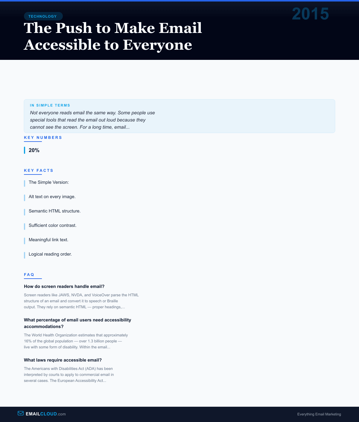
Alt text on every image. Not “image” or “banner.jpg” but descriptive text that conveys the same information the image communicates. If an image is purely decorative, it gets an empty alt attribute (alt="") so screen readers skip it rather than announcing “image” with no context.
Semantic HTML structure. Proper heading hierarchy (h1, h2, h3) so screen reader users can navigate by heading. Lists marked up as actual HTML lists, not visual simulations using dashes and line breaks. Tables used for data marked with proper headers and scope attributes; tables used for layout marked with role=“presentation.”
Sufficient color contrast. A minimum 4.5:1 contrast ratio for normal text and 3:1 for large text, following WCAG AA standards. This means no light grey text on white backgrounds, no pastel text on pastel backgrounds, and no information conveyed solely through color (a red “sale” price should also have a text label, not just a color change).
Meaningful link text. “Read our guide to email deliverability” rather than “click here.” Screen reader users often navigate by tabbing through links, hearing them out of context. “Click here” repeated six times communicates nothing. Descriptive link text tells the user where each link leads.
Logical reading order. The HTML source order matches the intended reading order, so screen readers present content in a sequence that makes sense. Complex visual layouts that rearrange content using CSS positioning can create reading orders that are incoherent when linearized.
Keyboard accessibility. All interactive elements — buttons, links, form fields — are reachable and operable via keyboard navigation. Users who cannot use a mouse must be able to tab through the email and activate any element.
The Current State: Progress and Gaps
By 2026, email accessibility has made meaningful progress from its years of near-total neglect. Major ESPs — Mailchimp, Klaviyo, HubSpot, Campaign Monitor — include accessibility warnings in their email builders. Litmus and Email on Acid provide automated accessibility audits. Template marketplaces increasingly advertise “accessible” as a feature. The European Accessibility Act has created legal pressure that reaches any company sending email to EU consumers.
But significant gaps remain. Many email templates still ship with missing or meaningless alt text. Color contrast failures are common, particularly in branded emails where brand colors were chosen without accessibility considerations. Image-only emails, while less common than a decade ago, have not disappeared. And perhaps most importantly, many email professionals — marketers, designers, and developers — still lack training in accessibility fundamentals.
The arc of email accessibility bends toward inclusion, but it bends slowly. The history of email is a reminder that technology is built by and for the people who build it, and when those people don’t include or consider users with disabilities, the technology excludes them. Making email accessible is not a technical challenge — the techniques are well-documented and well-understood. It is a priorities challenge, and the combination of advocacy, legal requirements, and commercial incentive is gradually pushing accessibility higher on the list.
For email marketers evaluating their own programs, the practical takeaway is straightforward: accessible email reaches more people, performs better in image-blocking environments, renders more reliably across clients, and increasingly satisfies legal requirements. It is, by any measure, better email.
Infographic
Share this visual summary. Right-click to save.
Related Events
Frequently Asked Questions
How do screen readers handle email?
Screen readers like JAWS, NVDA, and VoiceOver parse the HTML structure of an email and convert it to speech or Braille output. They rely on semantic HTML — proper headings, alt text on images, meaningful link text, and logical reading order — to make the content comprehensible. Emails built primarily with images, complex table layouts without proper roles, or missing alt text are often unintelligible to screen reader users.
What percentage of email users need accessibility accommodations?
The World Health Organization estimates that approximately 16% of the global population — over 1.3 billion people — live with some form of disability. Within the email context, visual impairments affect an estimated 2.2 billion people globally, including conditions ranging from color blindness (affecting roughly 8% of men) to complete blindness. Age-related vision decline also means accessibility needs increase across the entire subscriber base as populations age.
What laws require accessible email?
The Americans with Disabilities Act (ADA) has been interpreted by courts to apply to commercial email in several cases. The European Accessibility Act (EAA), effective June 2025, explicitly requires commercial digital communications — including email — to meet accessibility standards in all EU member states. Section 508 of the Rehabilitation Act requires accessible electronic communications from US federal agencies. Canada's Accessible Canada Act (2019) and the UK's Equality Act (2010) also apply to email communications.
Stay ahead of the inbox
Weekly tips on deliverability, automation, and growing your list. No spam, ever.
No spam. Unsubscribe any time. We respect your inbox.